


The heart from the original logo has been refined and used to bring emphasis to the word "hope" in the new logo. The new logo helps to create a more playful and friendly, yet professional feeling.


The color palette was chosen to create a harmonious brand expression and to help further the communication of the brand's attributes. Six colors were chosen in order to create flexibility and allow for the ability to adapt to different situations.

Playful dividers and bright colors help to create a hopeful and positive feeling for the website. Photographs mixed with illustration further this idea and help to humanize the people that the shelter serves.

For the main banner image, mixed media illustration helps to show a young girl's dreams being made possible through the work of the shelter. The playful mixing of illustration and photography helps to add dimension and lighten the tone of the organization.
Textures including brushstrokes and wavy dotted lines help to add a more personal touch.

Custom icons that incorporated the heart from the logo, were created to portray the shelter's three main programs.
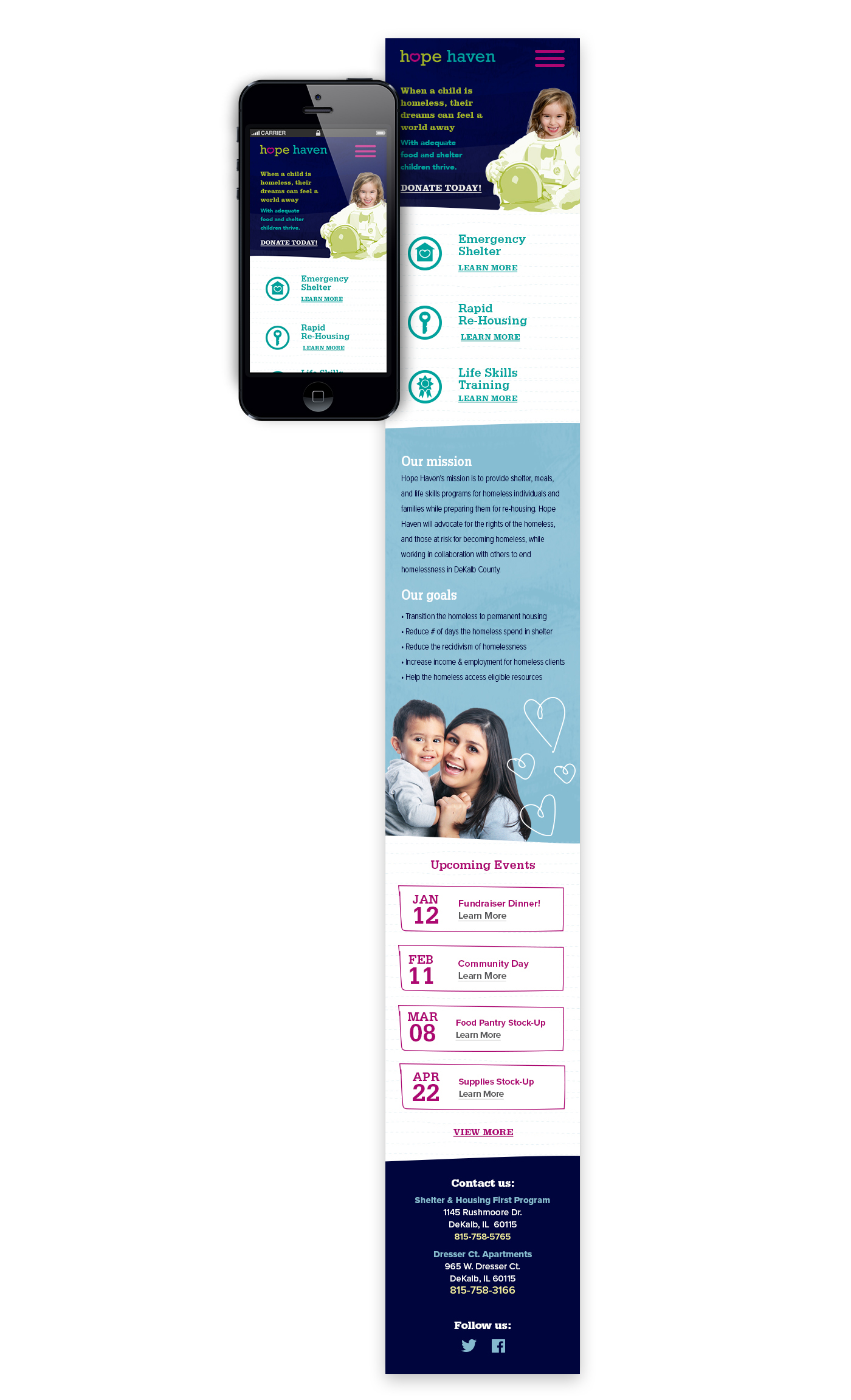
In the mobile version of the website, the menu is condensed and a call to action to donate is shown on the main banner image.


